Tuesday, April 12, 2011
Friday, April 08, 2011
Saturday, April 02, 2011
Friday, April 01, 2011
Friday, August 10, 2007
My suggestion would be to increase the impact of the art on the first page of your web site.
The below shows what I would suggest you do.

I would rethink the list of buttons you have on the first page. It might be better if they were black or grey in color
Home, links, artist sign in, and artist statement are unneccessary on the first page. They could be on the portfolio page. Home would be on every page, but the first.
Don't be tempted to overload your website because it's on the web and not a physical portfolio.
The changing image is nice as long as each image is equally strong/grabbing. I would suggest your best image be on the first page as a static image. Loading all of the extra info for changing images just makes your site take longer to pop up.
For your second page I would suggest several small images. Each one representing the styles of art you want to do.
Each one of them should take you to the pages as you have them set up, when it is clicked on.
The art is great.
The below shows what I would suggest you do.

I would rethink the list of buttons you have on the first page. It might be better if they were black or grey in color
Home, links, artist sign in, and artist statement are unneccessary on the first page. They could be on the portfolio page. Home would be on every page, but the first.
Don't be tempted to overload your website because it's on the web and not a physical portfolio.
The changing image is nice as long as each image is equally strong/grabbing. I would suggest your best image be on the first page as a static image. Loading all of the extra info for changing images just makes your site take longer to pop up.
For your second page I would suggest several small images. Each one representing the styles of art you want to do.
Each one of them should take you to the pages as you have them set up, when it is clicked on.
The art is great.
Tuesday, March 13, 2007
Wednesday, January 03, 2007
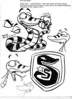
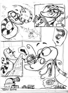
New Stellar art


Lynn,
Here's the new art for Stellar.
Please notice the glasses I added to him as a way of giving him personality/uniqueness.
Notice that his body is made up of curves and hard corners, his eyes are big for lots of expression, and his tongue only comes out when he has a big expression on his face. Fear or surprise.


